Zweiter Teil unserer neuen Reihe, diesmal zu Social Buttons
[Based on blogposts from mastersofmedia run by the students of the MA New Media & Digital Culture, University of Amsterdam]
The disambiguation of social buttons
New buttons are sprawling over social media platforms in 2015. Facebook is finally responding to ongoing requests for a Dislike button by testing its new Facebook Reactions, a differentiation of buttonised emotional responses. More and more platforms including Instagram, Facebook, Twitter and Pinterest are experimenting with Buy or Call to Action buttons, which allow for in-platform purchases. In November 2015 Twitter announced that it will change its stars into hearts, turning its Favourite button into a new Twitter like.
Social buttons have been part of social media platforms from the outset. Just a few months after its launch in 2006, Twitter introduced its Favourite button, followed by the Retweet button in 2009 and the rollout of the external Tweet button in 2010. Besides Twitter, Digg and Reddit popularised social buttons in 2006. Within Facebook, buttons were also introduced internally first, kicked off with the Share button in 2009, followed shortly by the internal Like button, which was offered as social plugin for implementing to webmasters just a year later.
Buttons have to be considered a key element of the “politics of platforms” (Gillespie 2010), which refers the platform’s ability to cater to a diverse set of actors, facilitated through technical features including plugins, APIs and capacities to build upon (Helmond 2015).
From this perspective, buttons take on at least two key roles: First, they allow users to express their affective responses in standardized, shortcut ways, making it possible to transform affective intensities into quantified extensities on counters (Gerlitz & Helmond 2013; Paßmann & Gerlitz 2014). These quantifications of affect are of value for data-mining, advertising and development within and outside of platforms.
Second, social buttons have enabled platforms to extend their means of data collection into the entire web. Once implemented by webmasters, users can act on external web content via platform feature and produce both content and data for the platform.
Hence, buttons are crucial for collecting, circulating and valuating user data in the wider platform ecosystem. Drawing on Agre (1994) they can be understood as “grammar of action”, as buttons offer pre-structured possibilities to interact, which at the same time capture these actions in pre-structured data-formats.
But how do emerging Buy buttons, Facebook Reactions or Twitter hearts tie into these platform politics? Do they continue the logic of quantifying affect and extending platforms into the web, or do they introduce a new twist to it?
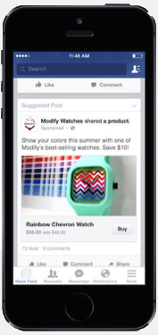
Buy or Call to Action buttons have been in the discussion for a while, however, have gained particular currency in 2015. Facebook has been offering the possibility to create shops since 2011, although with limited success. In 2014, the platform introduced its Call to Action Features (CTA), allowing users act on ads by booking, contacting, using apps, playing games, signing up for newsletters, shop or watching a video. A click on the CTA button would drive the user to a respective external website of the advertiser to complete the action. With CTA, Facebook expanded its grammars, adding new standardized possibilities to act to its platform.
In the same year, Facebook also started experimenting with Buy buttons, which would no longer send users to external websites, but keep the entire shopping experience within the platform. According to Buzzfeed, Facebooks’ current effort is to construct mini e-commerce sections in order to provide businesses the chance to set up second product homes within their Facebook pages. The currently tested “Shop section” should be placed bellow the “About section” of the company Page and would enable users to complete the entire shopping cycle – from product pursuit to product purchase – without ever leaving the platform.
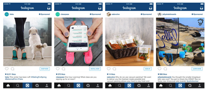
Similar to, yet before Facebook, Instagram announced to develop what they call a “direct-response-feature” which makes it possible to shop, install, sign-up and learn more. Just as in the case of Facebook, users will not have to leave the app but can complete the action within a small pop-up, rendering shopping into a full-fledged platform grammar.
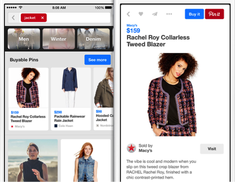
Just at the same time, Pinterest is rolling out “Buyable pins”, particularly on for its mobile app: “Coming soon to iPhone and iPad in the U.S., Buyable Pins let people buy things without ever leaving the Pinterest app”. In the context of Pinterest, the Buy button integrates rather seamlessly with making collections of desired items or objects of inspiration and the platform works jointly with major retailers to advance its buyable pin.
Twitter and Google are in the same boat as well. Twitter, as announced in September 2014, is still in beta testing its “Buy Now” button and Google is considering placing “Buy” buttons next to mobile search results, to make it faster for consumers to buy products that they are searching for from major retailers.
Among the key drivers to implement buttonised buying options is the growing importance of mobile apps and the specificity of mobile platform engagement. Mobile usage often focuses on single app engagement in contrast to switching between different browser tabs. Retailers have been complaining about loosing users in mobile shopping: “Mobile Internet use is way up, but it’s a pain to input credit card and shipping info on smartphones. “[Retailers] are getting a lot of cart abandonment on mobile devices,” Cathy Boyle, a senior analyst at eMarketer, remarks on Time.com.
Buy buttons would allow to complete purchases without having to leave an app and without providing shipping and payment details for each single store, hence lowering the effort to complete a purchase and retaining the user (and more importantly, the data they produce) within the platform.
Doing so, buy buttons at the same time continue, but also introduce a difference to the logic of platform politics outlined above. They expand the array of grammatised action, allowing platforms to monitor not only interest and intend, but also purchasing acts, adding new, highly valuable layers of data.
However, buy buttons do not contribute to the expansions of platforms into the web, but to the implosion of the web into the platform. Users remain encapsulated within the platform during their shopping experience and can return to scrolling through their feeds immediately afterwards. With pre-saved shipping and payment details and a reduction of clicks, buying becomes as fast and easy as clicking on a Like button and social and commercial life blend together once more.
Today we’re launching a pilot test of Reactions — a more expressive Like button. As you can see, it’s not a “dislike” button, though we hope it addresses the spirit of this request more broadly. We studied which comments and reactions are most commonly and universally expressed across Facebook, then worked to design an experience around them that was elegant and fun. Starting today Ireland and Spain can start loving, wow-ing, or expressing sympathy to posts on Facebook by hovering or long-pressing the Like button wherever they see it. We’ll use the feedback from this to improve the feature and hope to roll it out to everyone soon.
Posted by Chris Cox on Thursday, 8 October 2015
But Facebook did not only grammatise engagement with brands in a more granular fashion, it was its grammatisation of compassion that raised most debates 2015. In mid September, Mark Zuckerberg announced: “I think people have asked about the dislike button for many years. Today is a special day because today is the day I can say we’re working on it and shipping it” during a Q & A, adding that the new feature may come in a more nuanced form than a mere “Dislike!”.
Whilst social media circles were largely expecting an empathy or sorry button (with some exceptions), Facebook seemingly took inspiration from Buzzfeed and Path, announcing Facebook Reactions on Oct 08 2015. Reactions are basically a diversified and “more expressive Like button” (Cox 2015), allowing users to express „love,“ „haha,“ „yay,“ „wow,“ „sad“ and „anger.“
Facebook decided to go against the much-fabled Dislike button, for what the platform considers a more universal, broad and widely used set of emotional responses (Cox 2015). Facebook Reactions will be tested in Spain and Ireland first before being rolled out further. Reactions remain tied to the Like button: when clicking it, a pop-up with emojis appears and asks users to make a choice. Each Reaction comes with a counter that aggregates the number of “Yays” or “Hahas” received.
Whilst such grammatisation of feeling was possible within status updates through Facebook moods before, there were no such options for content posted by others. Facebook likens that Reactions will enable instant responses on content that is difficult to like, such as showing empathy or compassion to news of disasters or sad status updates.
Of course, one could type in such responses in the comment section. But there are limitations, as typing is more effortful on mobile apps and Reactions lower these barriers. Incentivising responses to “non-likeable” content is also relevant as content with few Likes can be disadvantaged by the Newsfeed algorithm, which prioritises the visibility of posts that generate engagement.
Reactions also allow to turn a wider array of affects into countable and comparable figures on counters. Just as in the case of Call to Action Buttons, Facebook Reactions contribute to the granularisation of grammars of action, moving from the rather open-ended Like to five demarcated and visually explicit choices of affect.
Early button based grammars such as Likes and Shares on Facebook or Retweets and Favourites on Twitter were initially designed to be relatively open to different interpretations – as one could like as an expression of compassion, for seeking attention, for agreement and as ironic gesture, just to name a few. Facebook Reactions however come with a more clear-cut affective dimension and objective, leaving less room for “interpretative flexibility” (Dijck 2012).
However, they also introduce more (too much?) choice for users and as Pachal (2015) argues, choice does not always go too well on Facebook and may lead to exploring the ambiguities of these clear cut grammars. We will have to see how users and platform will respond when Reactions will be deployed for cyberbullying, bashtagging or mismatch between content and response.
Dealing with ambiguity also features central with the third button novelty we want to address. In November 2015, Twitter announced that it will turn its Favourite button into a sort of Like, exchanging stars for hearts. Doing so, Twitter standardised affective button responses across all its platforms including Periscope and Vine – after having experimented with hearts on its Android and iOS apps over the summer.
The Favourite button was originally introduced only a few weeks after the launch of the platform in 2006, but Twitter never really pushed or promoted its functions (Paßmann & Gerlitz 2014). As a consequence, a variety of use cultures with associated third party apps emerged. Among these use cultures are users who treat the Favourite as a Twitter internal bookmark, in order to save interesting tweets worth returning back to. Such practice was supported by export features turning Favs into RSS feeds for readers or incorporating them into bookmarking software. From that perspective, given Favs can be cleared just as bookmarked pages.
Taking on a different interpretation, clearing Favs can be seen as social offence, namely when treating the Favourite as social expression of appreciation and acknowledgement (Paßmann & Gerlitz 2014). This interpretation was taken up and catered to by the third party service Favstar who aggregated Favs to generate rankings of most popular tweets and users.
Within these rather divergent interpretations (one focusing on bookmarking, the other on social value), Twitter took little initiative to diffuse the interpretative flexibility – the tech press even called Favourites the step-child of the platform. Quite contrary, the platform supported both interpretations: The Fly-Redesign of Twitter in 2011 made it easier to see who has favourited one’s own tweets whilst also showing Favs given.
However, already back then, Twitter expresses its desire to remain inclusive to new users who are not familiar with established use customs or specific interpretations of its features: “Twitter should be usable for people who know the shortcuts and also equally usable for those who don’t“ (Gannes 2011).
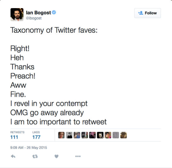 Ian Bogost suggesting a taxonomy of Twitter’s favourite button
The rollout of the the Twitter hearts brings this narrative back, as Twitter faces stagnating user numbers and seeks to lower its entry barriers: “The heart, in contrast [to the Favourite], is a universal symbol that resonates across languages, cultures, and time zones. The heart is more expressive, enabling you to convey a range of emotions and easily connect with people” (Kumar 2015).
Twitter presents its heart as more open and more expressive. But in the light of the history of the Fav, we suggest that hearts are actually doing the opposite: they contribute to reduce the interpretative flexibility of the Fav by focusing it on positive affect only. Using heart visuals and calling it ‘liking’, Twitter is letting go of its platform-specific Fav stars, and alludes to the practice of liking with which users are often already familiar from Facebook, Instagram or Pinterest – making it clear that this grammar of action is meant to be a gesture of appreciation. Just like Facebook’s Reactions, Twitter hearts are an attempt to reduce the ambiguity of platform grammars and facilitate a more straightforward extensification of intensities, focusing on selected affects rather than allowing space for open interpretation.
This reduction created considerable irritation amongst users once the hearts where introduced. Journalists who faved horrifying images or stories in the past to remember the respective post did not appreciate to see that these actions are now presented as “likes” and feel limited by the fact that Twitter now only seeks to facilitate positive affect: “The tiny red heart reveals that Twitter does not want us to talk about unpleasant things which cannot be loved, even on a casual, fleeting basis” (Bell 2015).
Interestingly, previous Twitter investor Chris Sacca suggested that the Favourite button does exactly the opposite, as “favouriting” is a too strong reaction and should be affectively toned down to facilitate positive feedback for more engagement. Twitter spokesperson Kumar took up this narrative in the introduction of hearts: “You might like a lot of things, but not everything can be your favourite.”(2015).
A discrepancy between user and platform interpretation of the button becomes apparent here. Users were not overtly keen and responded with ambiguity to this disambiguation. The subsequent discussion about affective sanitization and emotional regulation reminds us of the debate Facebook just sought to close with the introduction of Reactions.
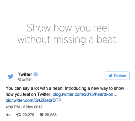 Introduction of Twitter hearts
Beyond making its objective more explicit and responding to dropping user numbers, the introduction of Twitter hearts also needs to be seen in the context of platform interoperability. A growing amount of tweets is produced outside of Twitter’s web interface on mobile apps, social media clients, automators or results from cross-posting from blogs, RSS-feeds, websites or other social media.
The question emerges, whether Twitter will allow its Like to circulate across platforms, adding to existing Likes on Facebook or Instagram or transferring these to Twitter – turning the Like into a universal platform grammar like the hashtag?
To come to an end, we see two key tendencies with the rise of these new buttons. First, these buttons are not primarily designed to enable platforms to expand into the web, as for instance external Like or Share buttons did. Instead, they allow the external web to be folded even more into the platform. Especially buy buttons allow previously external web data not just to be made platform-ready, but also to become platform-native in the first place, by installing the associated action such as buying or signing up for newsletters. What used to take place on external websites, is about to become integral part of the grammars of action of platforms. Doing so, the new buttons contribute to a larger development of encapsulating users in platforms, as Facebook is also experimenting with new forms of search in public posts, as well as advancing its provision of news, and is likened to strive for being “the new World Wide Web” that users do not have to leave at all (Benton 2015). These developments point to a new (or rather: parallel) dynamic of platformisation in which the platform does not strive to be part of the web, but be the web itself.
Secondly, Calls to Action, Reactions and Twitter hearts contribute to increase the granularity of both grammars and platform data, rending them more explicit and less open to interpretative flexibility. Reactions fast-track affective responses into five predefined options, they expand the spectrum of content that can be subject to button-based responses and fuel the databases with fine-grained and countable user affects. Similarly, Twitter hearts make away with the ambiguity of meaning and practices of the Fav by stripping it off too neutral and negative connotations. Both sets of buttons reduce the efforts users need to put in to respond affectively to content. With the introduction of hearts and Reactions, Twitter and Facebooks do not seek to maximize engagement with their grammars through interpretative flexibility, but reduce this flexibility to maximize the disambiguation of data.
Bibliography
Agre, P.E., 1994. Surveillance and Capture- Two Models of Privacy. The Information Society, 10(2), pp.101–127.
Bell, E., 2015. Twitter’s heart hits the wrong beat. Guardian. Available at: http://www.theguardian.com/media/2015/nov/08/twitter-heart-wrong-beat [Accessed November 9, 2015].
Benton, J., 2015. Facebook wants to be the new World Wide Web, and news orgs are apparently on board. NiemanLab. Available at: http://www.niemanlab.org/2015/03/facebook-wants-to-be-the-new-world-wide-web-and-news-orgs-are-apparently-on-board/ [Accessed November 9, 2015].
Dijck, J. van, 2012. Tracing Twitter: The Rise of a Microblogging platform. International Journal of Media and Cultural Politics, 7, pp.333–348.
Gannes, L., 2011. Twitter Redesigns to Be Simpler and Faster. AllThingsD. Available at: http://allthingsd.com/20111208/twitter-redesigns-to-be-simpler-and-faster/ [Accessed November 9, 2015].
Gerlitz, C. & Helmond, A., 2013. The Like economy: Social buttons and the data-intensive web. New Media & Society, 15(8), pp.1348–1365.
Gillespie, T., 2010. The politics of “platforms.” New Media & Society, 12(3), pp.347–364.
Helmond, A., 2015. The Platformization of the Web: Making Web Data Platform Ready. Social Media + Society, 1(2).
Kumar, A., 2015. Hearts on Twitter. Twitter Blog. Available at: https://blog.twitter.com/2015/hearts-on-twitter [Accessed November 9, 2015].
Pachal, P., 2015. Facebook Reactions are here, and they’re worse than we feared. Mashable. Available at: http://mashable.com/2015/10/09/facebook-reactions-problems/#sJnmjgCQy8qC [Accessed November 9, 2015].
Paßmann, J. & Gerlitz, C., 2014. ‚Good‘ platform-political reasons for ‚bad‘ platform-data. Zur sozio-technischen Geschichte der Plattformaktivitäten Fav , Retweet und Like. Mediale Kontrolle unter Beobachtung, 3(1), pp.1–40.
